I’m currently taking Dr. Echo Rivera’s class on Stellar Presentations, and trying hard to cut down on wordy Power Point slides to enhance learning.
I find it easier to do this in my undergraduate courses, where I can easily use imagery to make my points, but it’s proving more difficult in more advanced courses, such as those I teach to doctoral students on quantitative analysis.
I decided to challenge myself and take an old slide (probably from 2012-ish) and modify it using what I’m learning in Dr. Rivera’s course. So, here’s my starting point:
BORING!
I began by removing extra words, recognizing that full sentences are not required when you are speaking at the same time as you’re showing the slide. And then it hit me:
I’m speaking at the same time as I’m showing the slide.
So why not create a graphic representation of what I’m trying to demonstrate and then USE MY WORDS to explain the image?
Here’s my first attempt… a work in progress.
What am I saying at the same time?
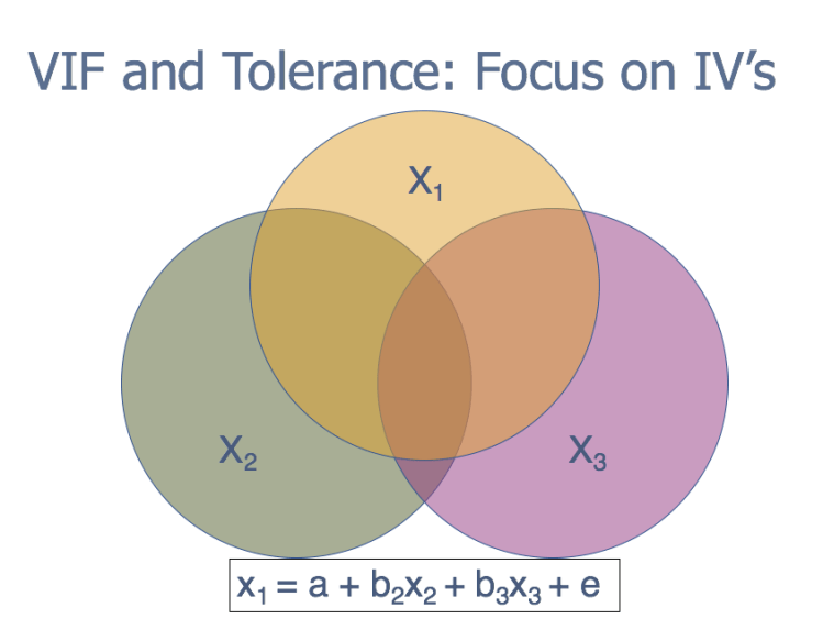
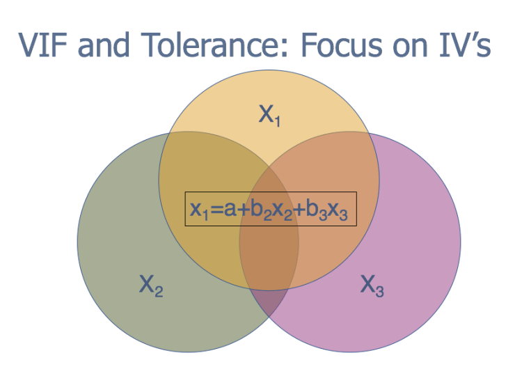
We measure multicollinearity by determining the amount of variation in X1 that’s explained by the other independent variables–in this case, X2 and X3.
To do this, we set up a regression equation: x1=a+b2x2+b3x3 and calculate an R-square.
As with a “normal” OLS regression, this indicates the proportion of variation in X1 explained by X2 and X3.
[Point at overlap between X1, X2 and X3. Indicate that X1 is likely the most problematic variable–what happens when it is removed?]
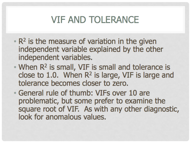
R2 small: little overlap between the variables, VIF & tolerance are close to 1
R2 big: more overlap, VIF increases quickly (no upper limit) and tolerance tends toward zero.
General rule of thumb is that VIF’s over 10 are problematic, but there’s much debate. Look for anomalous values.
(Thinking of moving the equation to the bottom)